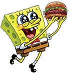
This was the norm for a while, especially during season 4. They used to do it every episode no matter what he acted like. That, along with his new, squeakier voice, now seem to only be employed when we're supposed to think he's annoying. For the most part, he has now gone back to his regular, kinda dorky-cute look. But his expressions can be wildly different sometimes. It's okay, though; aside from a few truly ugly episodes, the art has improved overall.
I love it when he makes really ugly faces for humor, though, no matter what episode or season. XD My personal favorite is on Can You Spare a Dime?
I'll grab two pieces of official art from the Group Pictures section on this blog to illustrate the change.


The latter is the more recent one. I personally prefer it to the first, but both are cute. ;)


No comments:
Post a Comment